DWG-01 · PORTFOLIO
SESSION 01 ONLINE

Good afternoon. It’s 16:02 in Katowice.

Hi, I’m Denis — Product Designer.

I build interfaces the way I designed spaces: from deep research to the final detail.

PROJECTS

Tell me about yourself

Denis Mokrushin — Product Designer

I’m Denis, a Product Designer based in Katowice, Poland. For four years I designed interiors and 3D visualizations. For the past year I’ve worked as a freelance UX/UI designer, taking web products end to end: research, information architecture, interface and developer handoff.

I’m finishing a Bachelor’s in Information Architecture (2027) and I’m open to Junior UX/UI and Product Design roles. I can start right away.

Katowice, PL · Remote / Hybrid · B2B or UoP · ● Open to work

What’s your experience?

2025 — nowFreelance Product / UX/UI & Web DesignerA year of freelance UX/UI work for real clients. I designed and launched two responsive websites on WordPress: an interior studio portfolio and an online course platform. I set up Google Analytics and Hotjar to keep testing the lead forms.2 sites launched
2022 — nowInterior & Spatial Designer / 3D VisualizerCommercial interior design and architectural visualization in 3ds Max, Corona, ArchiCAD and AutoCAD. I presented concepts to clients, handled objections and got sign-off at every stage.4+ years · client-facing

Full CV → Download CV (opens in a new tab)

How do you work?

Five steps, and I go back whenever the data tells me to.

  1. Research. Competitor and market analysis, qualitative and quantitative research. I want to know who I’m designing for before I draw anything.
  2. Information architecture. Site maps, user flows and task analysis. Most problems get solved here, before the interface exists.
  3. Wireframes and UI. Low-fi options first, then high-fidelity UI in Figma on a token-based design system.
  4. Handoff and launch. Specs and Dev Mode for developers, or I build it myself in WordPress, including domain and hosting.
  5. Measure and improve. After launch I track behavior in Google Analytics and Hotjar heatmaps and keep testing the lead forms.

Show me your projects

Why did you move from interiors to UX?

For four years I designed interiors. The part I liked most was never the final render. It was the plan: how people move through a space, what they see first, where they get stuck.

When I started my degree in Information Architecture in 2023, I saw that interfaces are the same problem in a different material. I kept the habits from interiors: research before drawing, a reason behind every decision, and presenting the work until the client says yes.

What tools do you use?

Grouped by the stage where I use them.

Research

  • Useberry
  • Hotjar
  • Google Analytics
  • Miro

Structure

  • FigJam
  • Notion
  • Jira

Interface

  • Figma (Dev Mode, Auto Layout, Variables, Components)
  • Design Systems
  • WordPress (Elementor, Astra)
  • HTML / CSS

Spatial & visual

  • 3ds Max
  • Corona Renderer
  • ArchiCAD
  • AutoCAD
  • Illustrator
  • Photoshop
  • darktable

AI

  • Claude
  • v0
  • Bolt
  • ChatGPT

Exploring

  • Framer
  • Webflow
  • Bubble
  • Make

How do you use AI?

I use AI to move faster, not to make the decisions. Claude and ChatGPT help with desk research, competitor analysis, ideas and UX microcopy. v0 and Bolt give me quick layout drafts I can click through before I open Figma.

For Eskiz, I used AI-assisted desk research to compare five competitors. The personas, flows and final decisions still came from me.

  • Claude
  • v0
  • Bolt
  • ChatGPT

Where do you study?

Bachelor’s Degree in Information Architecture (in progress)

University of Silesia in Katowice · 2023 — 2027 (expected)

Focus: Information Architecture, UX Research, Usability Testing, WCAG / Accessibility, Web Technologies, Database Systems.

What are your conditions?

LocationKatowice, Poland
FormatRemote or hybrid
ContractB2B or UoP
LanguagesEnglish B2 · Polish B2 · Russian native
AvailableImmediately

I can’t answer that one yet, but I’d be happy to in person. Contact

SUGGESTED

00_overview.md

Eskiz — SaaS CRM

Concept project · 2026 · Product Designer

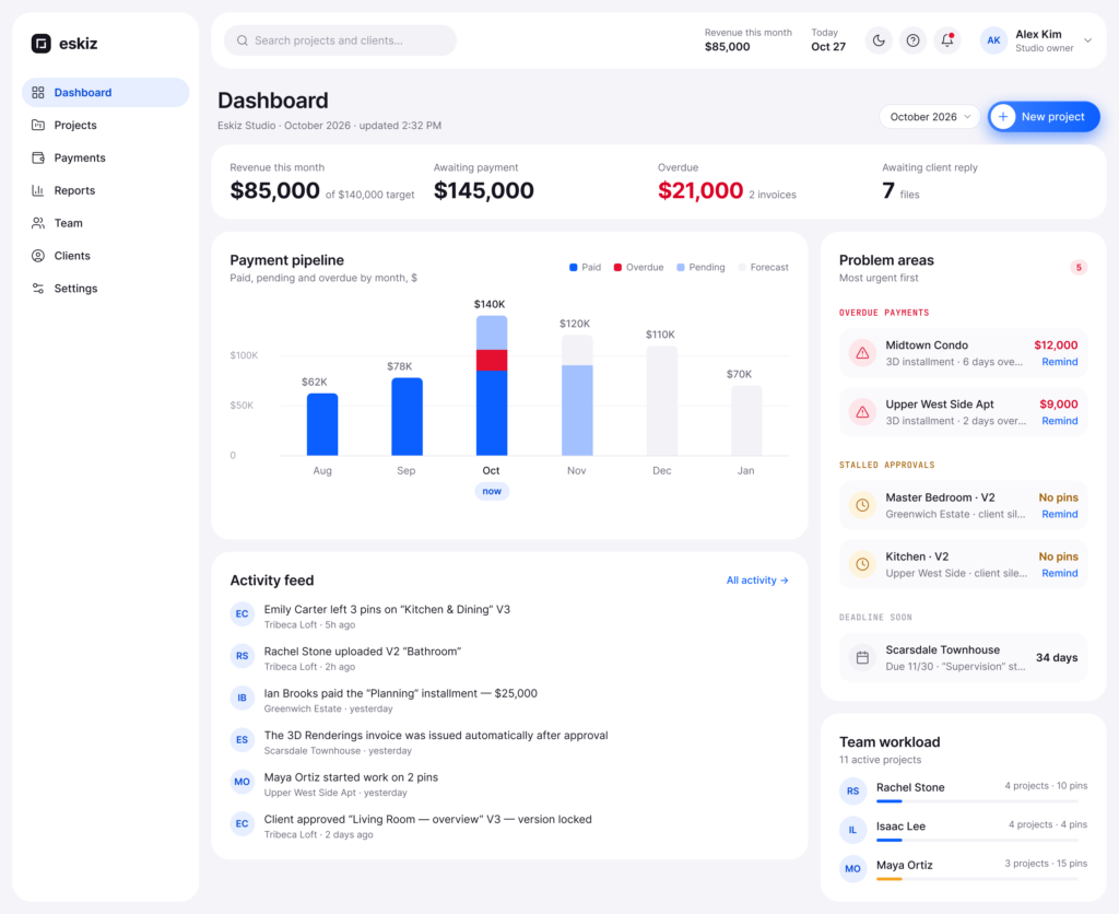
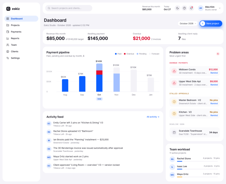
Eskiz studio dashboard: revenue, payment pipeline by month and problem areas sorted by urgency

The problem

Interior studios run every project through two kinds of tools that don't talk to each other. Clients send feedback on renders as voice notes and chat messages that point to old versions. Stage payments live in spreadsheets. Designers spend unpaid hours matching comments to the right file, and owners notice cash gaps too late.

The idea

Eskiz is a CRM for interior studios that puts feedback, approvals and stage payments into one flow. The client pins a comment right on the render, the designer fixes it in the next version, the client approves, and the approval sends the stage invoice.

Three roles

  • Studio owner: a dashboard sorted by risk — overdue payments, stalled approvals, deadlines.
  • Designer: every client comment pinned to the exact spot, with its status.
  • Client: a mobile viewer with no account, one tap to approve.

My role

Solo, end to end, in one week: desk research, information architecture, user flows, wireframes, UI for desktop, tablet and mobile in light and dark themes, a design system and a clickable prototype.

This is a concept project. It hasn't been built yet. I showed it to friends who work at architecture studios, and they said a tool like this would save them real time.
01_research.md

Research

Competitors · Pains · Roles · From insights to decisions

Desk research, October 2026: product pages and user reviews of five tools (Capterra, G2), industry articles and studio forums. I used AI to speed up the competitor comparison; the conclusions are mine.

Competitors

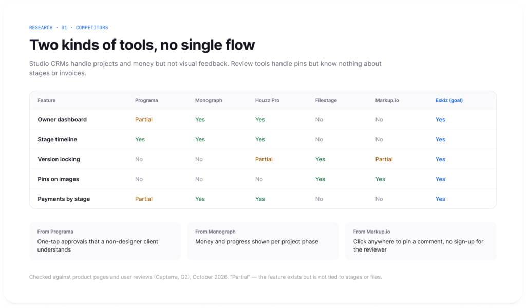
Two kinds of tools, no single flow. Studio CRMs (Programa, Monograph, Houzz Pro) handle projects and money but not visual feedback. Review tools (Filestage, Markup.io) handle pins but know nothing about stages or invoices.

What I took: one-tap approvals a non-designer client understands (Programa), money and progress per project phase (Monograph), click anywhere to pin a comment with no sign-up (Markup.io).

Competitor matrix comparing Programa, Monograph, Houzz Pro, Filestage and Markup.io with Eskiz across five features

Pains

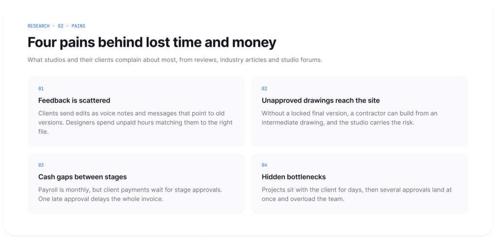
  1. Feedback is scattered: edits come as voice notes pointing to old versions.
  2. Unapproved drawings reach the site: without a locked final version, a contractor can build from a draft.
  3. Cash gaps between stages: payroll is monthly, but payments wait for approvals.
  4. Hidden bottlenecks: projects sit with the client for days, then several approvals land at once.
Four studio pains: scattered feedback, unapproved drawings on site, cash gaps between stages, hidden bottlenecks

Roles

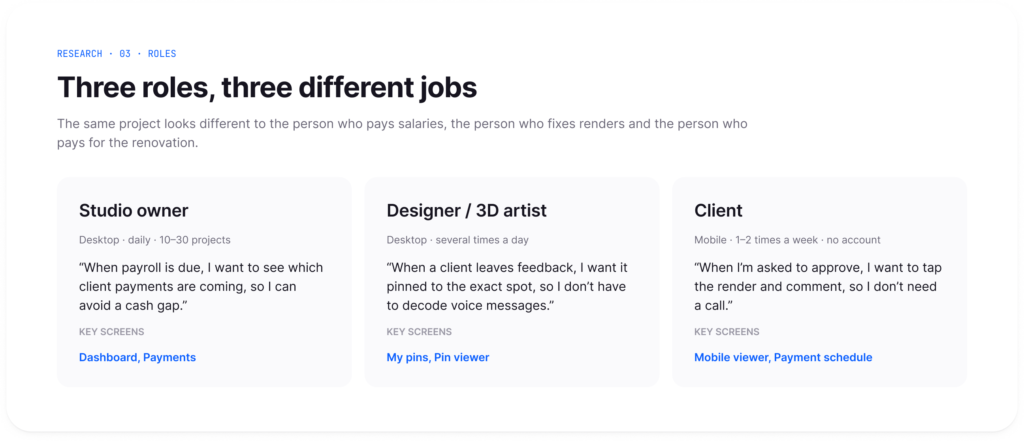
  • Studio owner, desktop, daily, 10–30 projects: "When payroll is due, I want to see which client payments are coming, so I can avoid a cash gap."
  • Designer / 3D artist, desktop, several times a day: "When a client leaves feedback, I want it pinned to the exact spot, so I don't have to decode voice messages."
  • Client, mobile, 1–2 times a week, no account: "When I'm asked to approve, I want to tap the render and comment, so I don't need a call."
Three roles with their jobs to be done: studio owner, designer and client

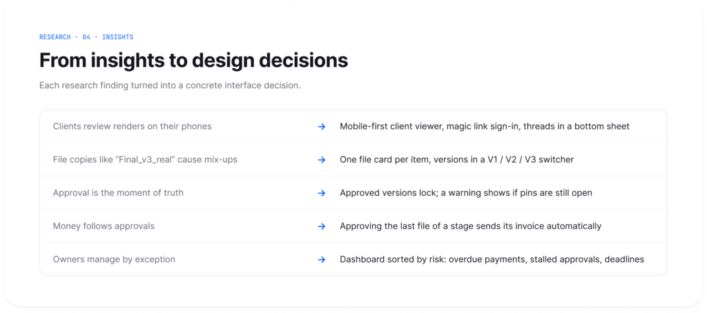
From insights to decisions

  • Clients review renders on their phones → mobile-first client viewer, magic-link sign-in, threads in a bottom sheet.
  • Copies like "Final_v3_real" cause mix-ups → one card per file, versions in a V1 / V2 / V3 switcher.
  • Approval is the moment of truth → approved versions lock; a warning shows if pins are still open.
  • Money follows approvals → approving the last file of a stage sends its invoice.
  • Owners manage by exception → the dashboard is sorted by risk.

02_architecture.fig

Architecture

Site map · User flow

Site map

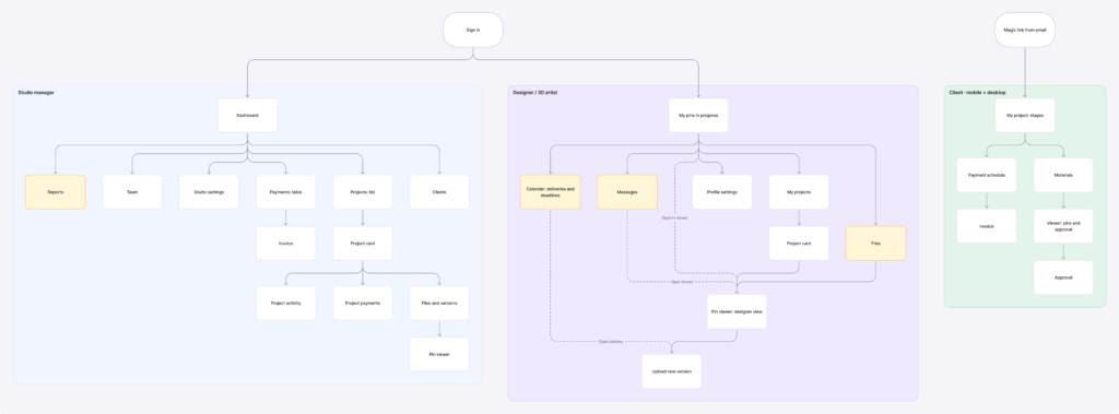
Three roles share one product but see different entry points: the owner starts on the dashboard, the designer on their pins, the client on a single file link.

Eskiz site map with entry points for the studio owner, the designer and the client

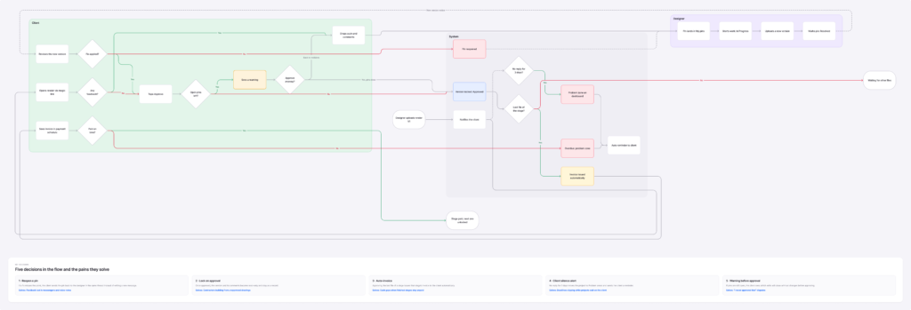
User flow

The core loop: the client pins a comment → the designer uploads a new version → the client approves → the version locks → the last approval of a stage sends the invoice.

03_wireframes.fig

Wireframes

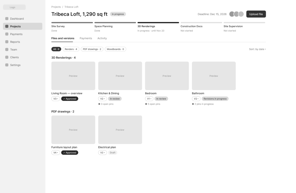
Option A — Tabs · Option B — One page with a right column · Option C — Stage navigation (chosen)

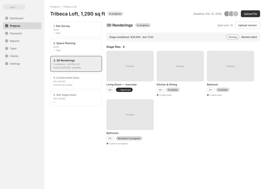
The project card is the core screen: files, stages and money meet there. I sketched three layouts.

Option A — Tabs

Files, Payments and Activity in tabs. Familiar and focused on files, but payments hide behind a click.

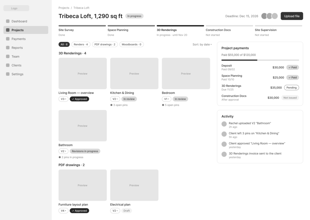
Option B — One page with a right column

Files in the main column, payments and activity always on the right. The whole picture on one screen, but dense, with less room for previews.

Wireframe option B: project card with files in the main column and payments on the right

Option C — Stage navigation (chosen)

Stages on the left; files and the invoice of the selected stage on the right. In studios, money and approvals are tied to stages, so this layout shows the link "file approved → invoice sent" and lets the owner see progress and payments in one place. The trade-off is harder access to all files at once, so I added a separate "All project files" link and a Files section.

Wireframe option C, chosen: stages on the left, files and invoice of the selected stage on the right

04_ui.fig

Ui

Studio dashboard · Project card · Pin viewer · Payments · Client on mobile · Dark theme

Studio dashboard

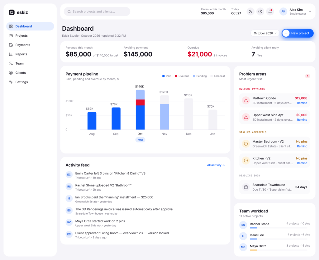
Revenue, awaiting payments and overdue invoices at the top; problem areas sorted by urgency on the right, so the owner sees what needs attention first.

Studio dashboard with revenue, overdue invoices, payment pipeline and problem areas

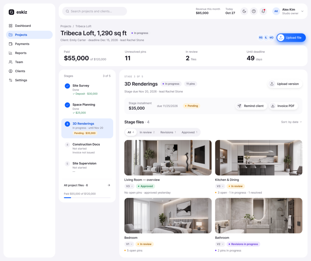
Project card

Stages on the left, the selected stage's files and installment on the right.

Project card with five stages on the left and the 3D renderings stage files and installment on the right

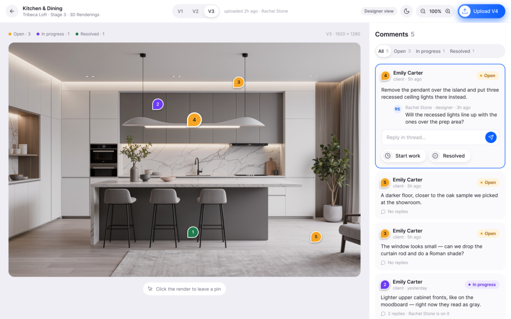
Pin viewer

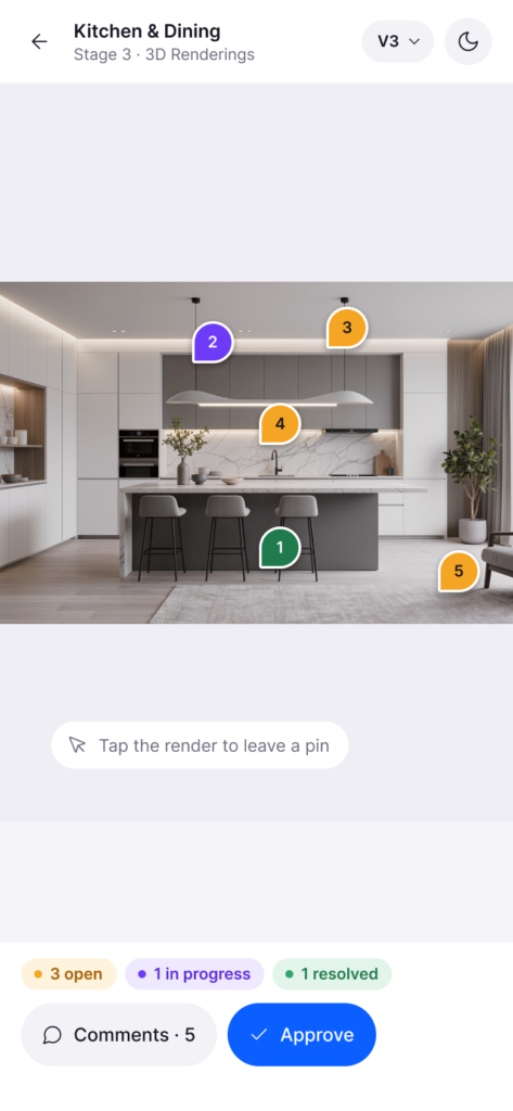
The designer sees every pin on the render with its status: open, in progress, resolved. Versions switch between V1, V2 and V3.

Pin viewer: kitchen render with numbered client pins and a comment thread on the right

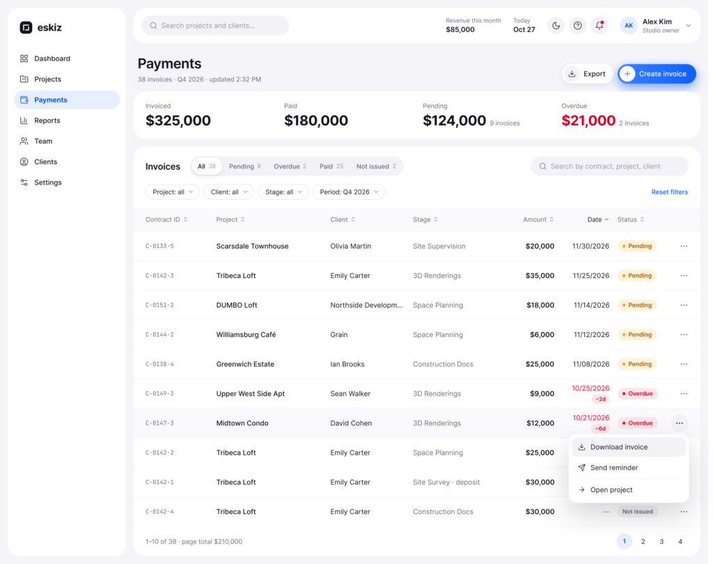
Payments

Every installment by project and stage, with reminders for overdue ones.

Payments screen listing installments by project and stage with their status

Client on mobile

No account, a magic link, tap the render to leave a pin, one button to approve.

Client mobile viewer: render with pins and an Approve button, no account needed

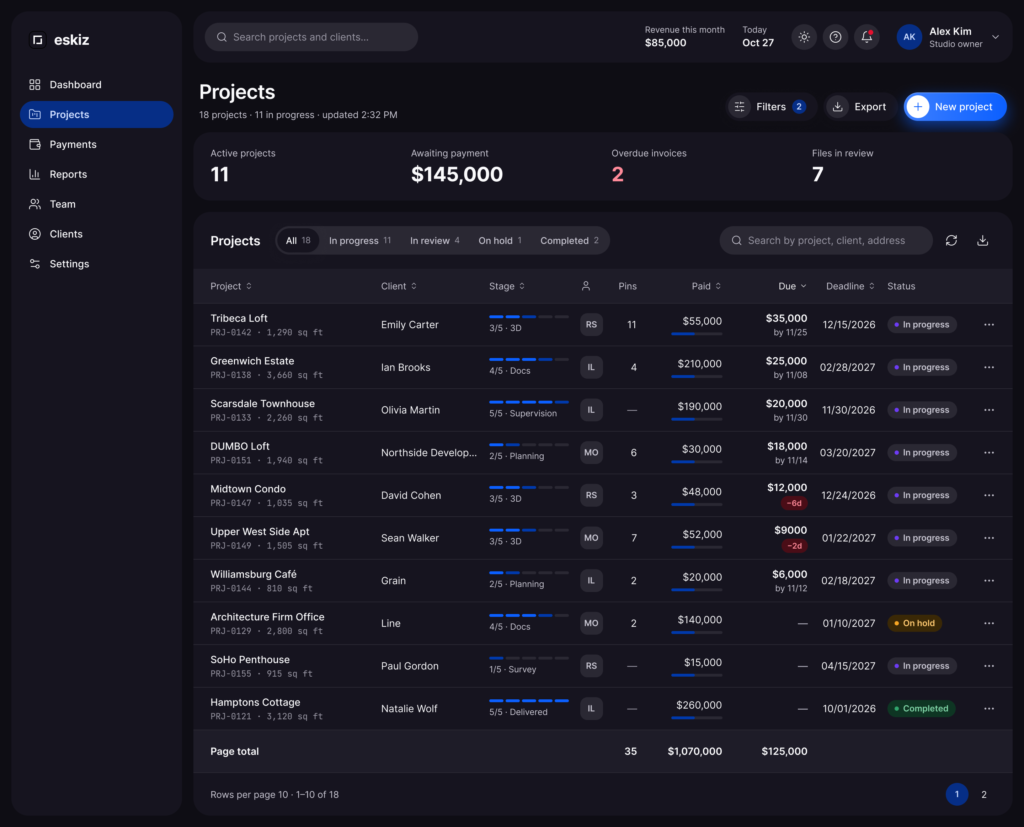
Dark theme

Every screen also works in a dark theme.

Projects in the dark theme

05_design-system.fig

Design system

Foundations · Components

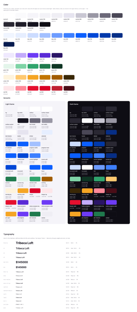
Foundations

Color, typography, spacing and radius tokens for light and dark themes.

Design tokens: color, typography, spacing and radius for light and dark themes

Components

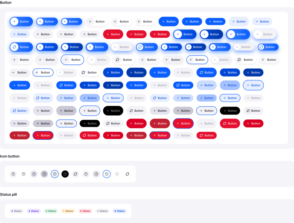
Buttons, badges, file cards, pins, stage items and navigation, built on those tokens.

Component library: buttons, badges, file cards, pins, stage items and navigation

06_results.md

Results

What came out · What I learned · What's next

What came out

  • A complete concept in one week: research, site map, user flows, three wireframe options, final UI and a clickable prototype.
  • Seven key desktop screens in light and dark themes, plus tablet and mobile versions, including the client's mobile approval flow.
  • A token-based design system: foundations and components.
  • Informal feedback from friends who work at architecture studios: they said a tool like this would save them real time.
What I learned

  • Starting from money, not from screens, changed the structure: once I saw that payments follow approvals, stages became the main navigation.
  • Three roles need three different interfaces: the owner manages by exception, the designer works pin by pin, the client only needs to tap and approve.
  • Writing down the trade-off of each wireframe made the final choice easy to explain.

What's next

  • Talk to studio owners about how they track stage payments today, before building anything.
  • Add a contractor role, so approved drawings go straight to the site team.
  • Connect invoices to accounting tools.